
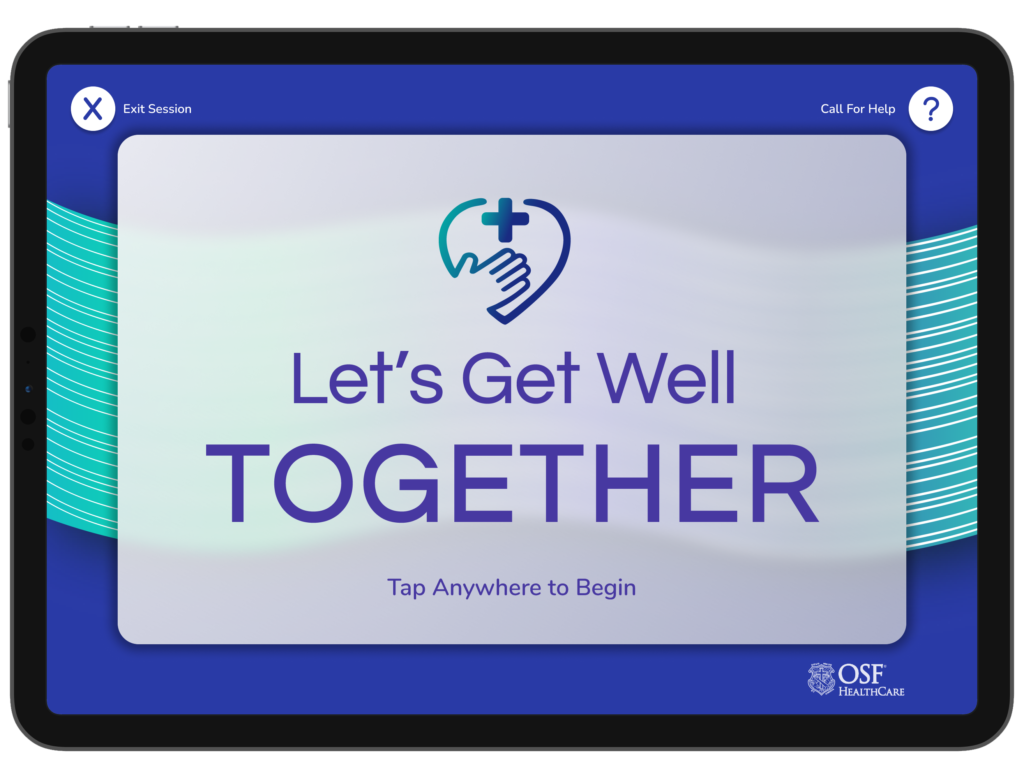
OSF Project
In this project, I worked with a team of talented designers, and in collaboration with both OSF and Jump Simulation. My team and I designed a kiosk application to be used by the homeless population to assist them with healthcare, transportation, and financial needs or opportunities.
Case Study
Problem Statement
The homeless population often faces challenges accessing basic necessities, particularly healthcare, transportation, and financial opportunities. Traditional solutions often require multiple touchpoints, scattered across a city, making it difficult for individuals to find and take advantage of these services. There was a need to develop an application that centralized these services and made them available in critical areas.
Objective
Design a user-friendly kiosk application that can centralize information on healthcare, transportation, and financial opportunities tailored for the homeless population, ensuring that it’s intuitive, robust, and low-barrier to use.
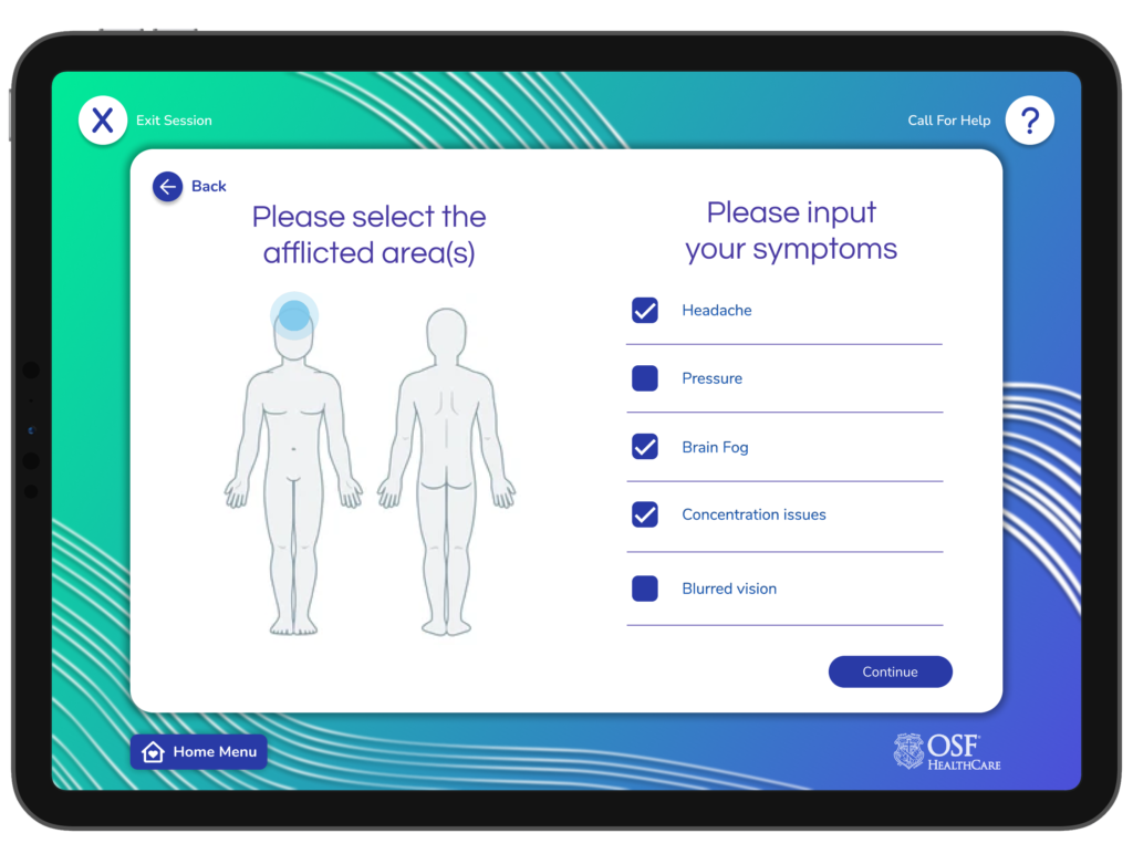
Research & User Interviews
Our team conducted thorough research into homeless shelters and service providers to understand the context and specific needs. Observations included:
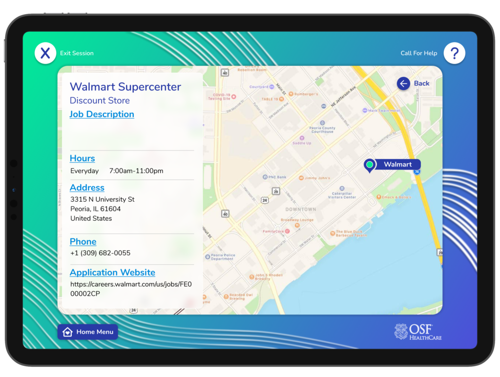
- The rising unemployment rate signaling need for a job board function
- The varying literacy levels throughout the population
- A general mistrust of technology and digitized platforms
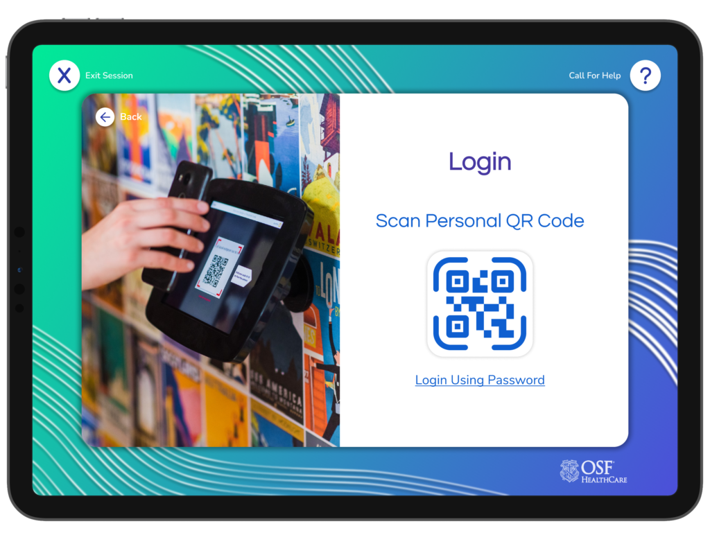
- Online profiles to support and encourage service usage
- A need for immediate and actionable information
We also spoke to several homeless individuals and service volunteers to gather pain points, needs, and preferences. Key insights included:
- 76% faced difficulty in access health or medical services
- 68% expressed the need for financial income or employment
- 60% were unaware of the transportation benefits and options available to them
Design Process
Information Architecture
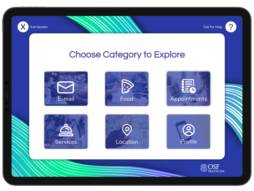
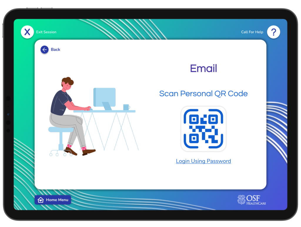
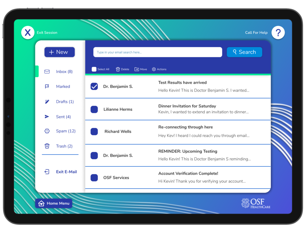
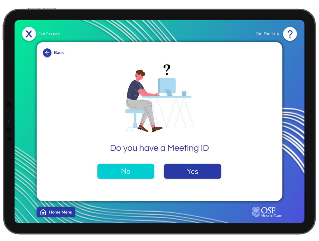
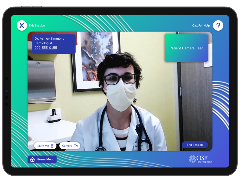
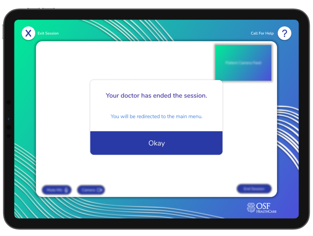
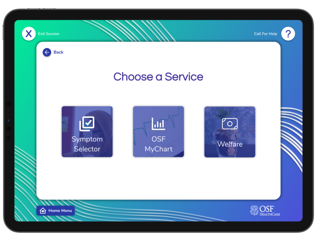
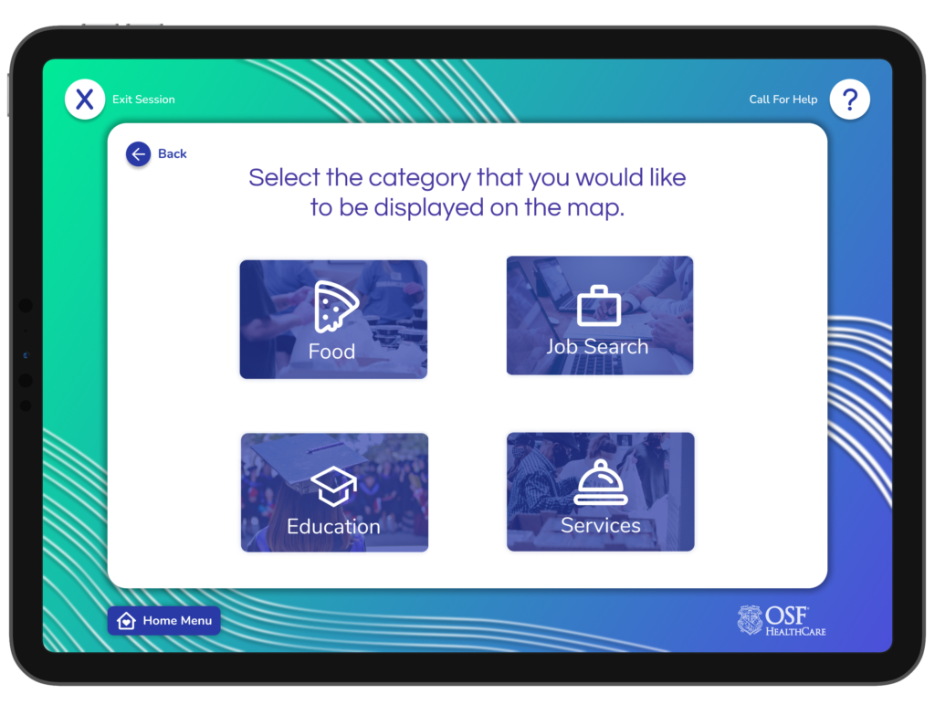
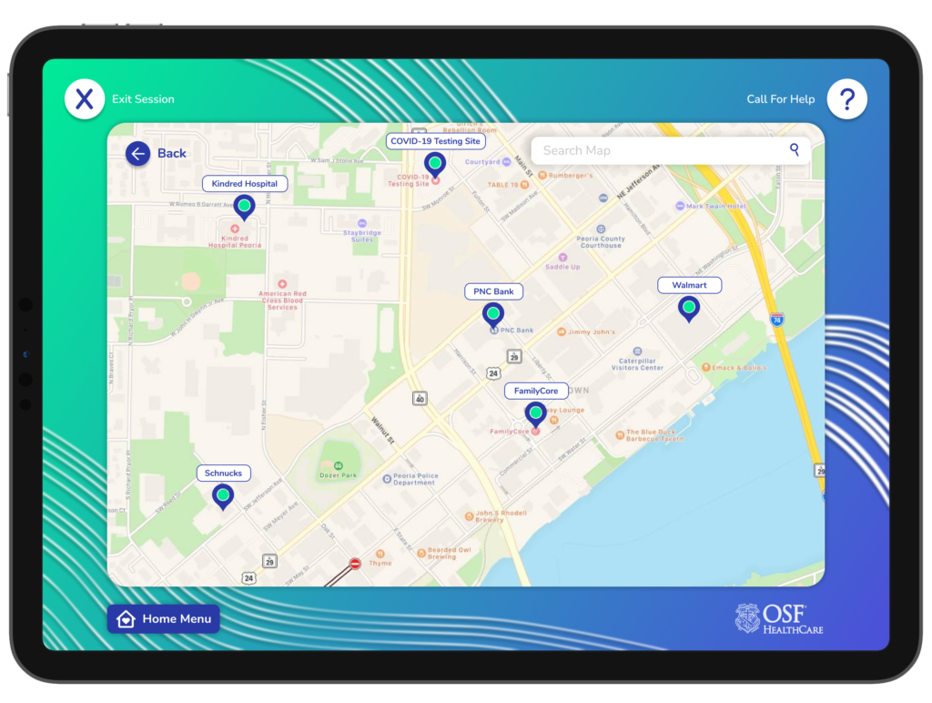
The information architecture focused on catering to the diverse needs of our users, providing simplistic digital access to a variety of services. The application was structured into six primary modules: Email, Food, Appointments, Services, Location, and Profile. Each module had consistent but unique sub-sections like nearby clinics, bus routes, job postings, etc.
User Flows
Several distinct user flows were developed to ensure efficiency in core functions of the application. We used these to map the expected user journey and experience through our developed architecture. These user flows ensured:
- Immediate access to medical contact and services
- Easy access to public transportation options and schedules
- Organized options for food services, locations, and stamp options
- Easy setup of critical general services, such as profile and email
- Detailed map and location services
Wireframing & Prototyping
Through insights and inspiration from OSF and Jump Simulation the wireframes and subsequent high-fidelity prototype was developed in Figma. Our commitment to reiteration and integration of user feedback helped us ensure that our application had:
- Quick access to a variety of provided services
- Large, clear icons for quick and simple navigation
- Straightforward language and expectations
- Catered to a widely diverse group of users
User Testing
We conducted usability tests with 20 individuals from our initial interview pool. Feedback helped iterate the design, ensuring it catered to actual user needs and was free from jargon. Some of our core findings indicated that:
- 85% felt that navigating the UI was “very efficient”
- 95% felt “very strongly” that this application could benefit the homeless population
- Some users expressed general concern about the possibility of people forgetting their account information
Key Features
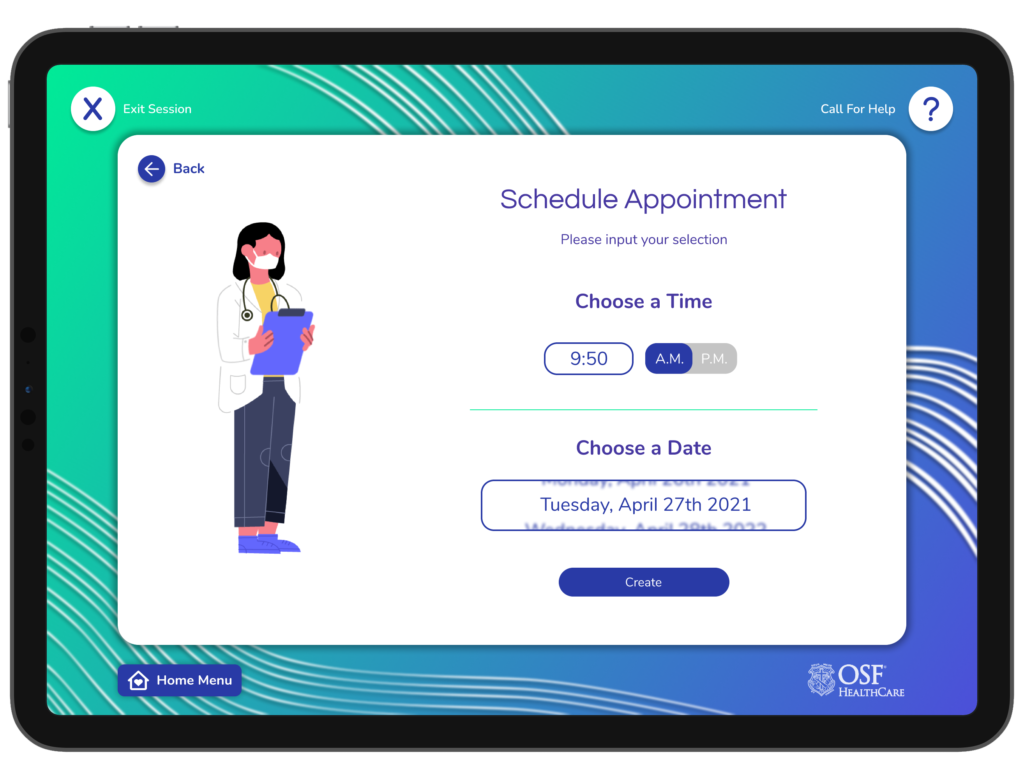
- Medical and emergency service contact and scheduling
- Food map (including information on food stamps and soup kitchens)
- Profile setup for general services (I.E. email)
- Job board forums
- Interactive map
- Transport scheduler
Conclusion & Future Steps
Our homeless kiosk tablet application was well-received, acting as a bridge between the homeless population and essential services. Collaborating with OSF and Jump Simulation provided valuable insight, and helped to ensure the solution was both technically robust and user-centered. Future steps for this application would include:
- Integration of tablets, apps, and kiosks >>> Expansion of kiosk locations and network
- Collaboration with more organizations to expand job postings and service variety
- Iteratively refine the UI based on continual user feedback
Tools & Skills Used
Tools
- Figma
- Utilized for crafting high-fidelity wireframes and interactive prototypes. Figma facilitated real-time feedback, allowing for rapid iteration and refinement of the design. Additionally, Figma was utilized to develop persona graphics and to help outline information architecture
- Adobe XD
- Utilized temporarily for developing low-fidelity mockups and design ideas
- Adobe Illustrator
- Leveraged to design custom elements, iconography, and the mood board. Illustrator’s precise and expansive toolkit enabled the creation of detailed and visually cohesive assets tailored specifically for the kiosk-based environment of this tablet prototype
- Google Products
- Extensive use of various google products (Sheets, Forms, Calendars, Drive, etc.) for conducting and organizing user interviews, scheduling sessions, and collecting feedback. This ensured that the user’s voice was central to the design process, and the insights gathered directly influenced the application’s evolution
Skills
- Mockups and Wireframes
- Using Figma, I crafted detailed wireframes that laid the groundwork and provided clarity for the user interface. I transitioned these mockups, infusing color, typography, and aesthetic details to create high-fidelity visuals. This brought the user interface to life, and enabled team members and clients alike to visualize the end product in a realistic and interactive manner
- Asset Creation
- Leveraged Adobe Illustrator’s precision and versatility to create high-quality, scalable vector graphics that were crucial to the interface. I designed a wide range of assets, from icons and buttons to illustrations and branding elements. These vector assets are not only visually appealing, but optimized for various platforms to ensure consistency.
- Information architecture Design
- Orchestrated the logical structure and organization of the application’s content and functions. This ensured a seamless and intuitive navigation experience for users
- Persona creation
- Developed detailed user personas to encapsulate the needs, preferences, and pain points of the target audience. These personas acted as a guiding beacon throughout the design process, ensuring alignment with users’ needs and expectations
- User interviewing and testing
- Conducted thorough user interviews to gather qualitative data about user needs, challenges, and expectations. Subsequent user testing sessions provided valuable insights into the application’s usability and highlighted areas for improvement
- Visual design & aesthetic
- Crafted a visually appealing interface and aesthetic that not only looked good but enhanced the functionality and intuitiveness of the tablet-kiosk experience